


Blog posts
-
Embedded below is the survey form and two examples to test noisycharts. If you’re having difficulty with the embedded form, the direct link is here, and the chart examples are chart 1 and chart 2.
-

A guide on using Python to measure and compare the stats for TikTok videos on specific hashtags
-

I’ve been experimenting and trawling through the academic literature to figure out what the best ‘default’ approach to sonification should be, to ensure we have the best possible approach to audio accessibility in our charts. Here’s a summary of what I’ve found in the hope that it might be helpful for others
-
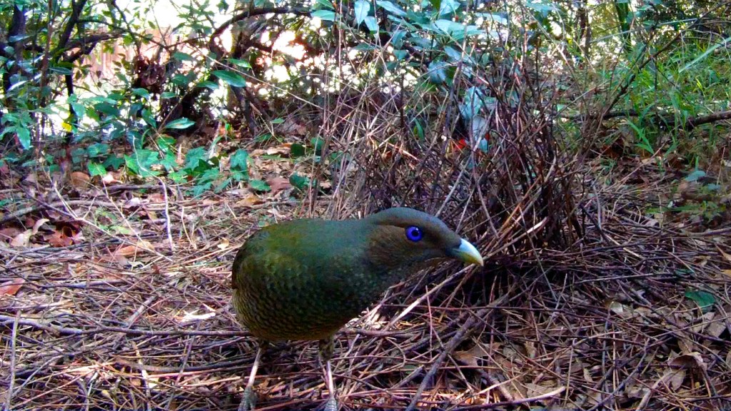
It has been a warm start to spring, and my neighbourhood has been absolutely overrun by a mob of rowdy, horny, young satin bowerbirds. I’m assuming they’re mostly juvenile males from the behaviour (hanging out in parks, acting moody, vaping …) but I’m no ornithologist, so take my observations with a grain of salt. One of
-
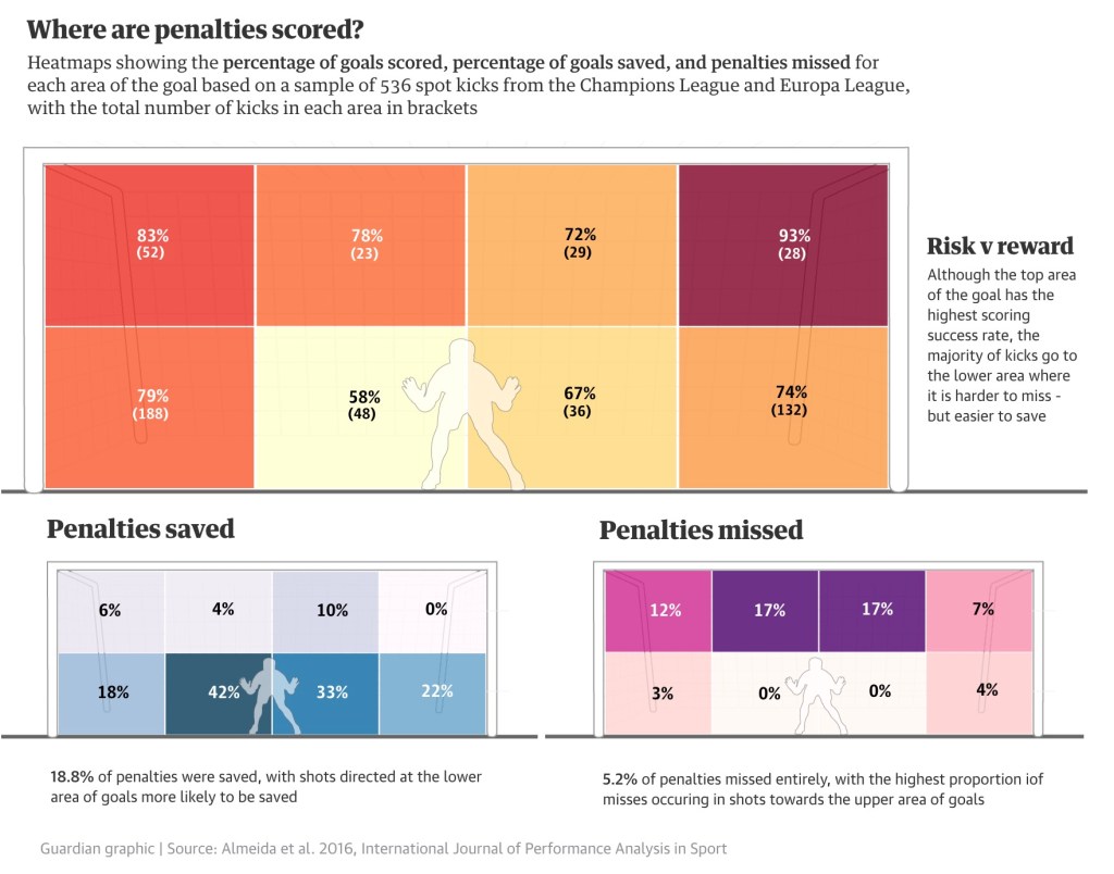
Australia’s win over France in the Women’s World Cup featured the longest penalty shootout in World Cup history – 20 spot kicks were taken, six more than the record of 14 set just a week earlier when Sweden beat the USA, and eight more than the men’s tournament record of 12. Even outside penalty shootouts,
-

During the last Australian election we ran an ambitious project that tracked campaign spending and political announcements by monitoring the Facebook pages of every major party politician and candidate. The project, dubbed the “pork-o-meter” (after the term pork-barreling), was hugely successful in being able to identify distinct patterns of spending based on vote margin, or incumbent party, with
