- Introduction
- What does research say about the best practice for data sonification?
- 1. Add audio context to the x and y axis
- 2. Keep your audio in a comfortable range that works across devices
- 3. Use instrument-like sounds
- 4. Use stereo panning to distinguish data series
- 5. Map your data to your audio in a way that “makes sense” to the listener
- 6. Play the data neither too fast, nor too slow
- 7. Offer different modes for different tasks
- Conclusion, and a design preview
Introduction
I’m currently working on two seperate but related sonification projects.
The first is noisycharts, a tool that creates animated charts with sonification for use in audio, video and social media, and allows a lot of customisation and options to create the final output.
The other project is designing a default audio accessibility mode which will be used in all of the charts published by the Australian office of The Guardian.
In building these applications over the past year I’ve experimented with various approaches to sonification to get a sense of what works and what doesn’t.
I’ve also been trawling through the academic literature to figure out what the best ‘default’ approach to sonification should be, to ensure we have the best possible approach to audio accessibility in our charts. Here’s a summary of what I’ve found in the hope that it might be helpful for others.
What does research say about the best practice for data sonification?
As the audio accessibility feature I’m building mostly relies on the mapping of data to sound frequency I’ll be focusing on this approach, though several of the linked papers do cover other approaches.
The guidelines below are drawn largely from Nees and Walker (2007), Flowers (2005), Brown et al. (2003), and some other papers as cited. It also includes personal observations based on my own experience developing a data sonification tool.
The big caveat here is that many of the studies reviewed (though not all) did not test sonification approaches with people who are visually impaired.
1. Add audio context to the x and y axis
Summary
This means adding extra features to the audio chart that make the interpretation of data easier. Features you could consider:
- If you’re not using a single note for each datapoint on the x axis, consider adding a click track or similar to denote x axis “ticks”. For example, if you were sonifying data with a datetime axis, you might add a click on each full year, or every 5 years, or something like that
- An audio tone corresponding to the minimum and maximum y axis values so the listener can put the tones representing the data in context with these values
- If there is another particular important value in the y axis data, like a temperature threshold, historical record or similar, you could add a special tone when this value is crossed, or play a tone that corresponds to this value throughout, provided it uses a different instrument or timbre to the main data series
Background
Smith and Walker’s 2005 paper in the journal Applied Cognitive Psychology shows audiocharts with additional x and y axis context, such as min and max value tones for the y axis or clicks to represent the x axis, improves “point estimation” from audiocharts.
Context refers to the purposeful addition of non-signal information to a display. In visual displays, additional information such as axes and tick marks can increase readability and aid perception by enabling more effective top-down processing (Bertin, 1983; Tufte, 1990). If one is able to view labelled tick marks along the axis of a graph, for example, one is better able to judge the data dimensions and magnitudes being displayed (Bertin, 1983). A visual graph without context cues (e.g. no axes) provides no way to estimate the value at any point. The contour of the line provides some incidental context, which might allow an observer to perform a trend analysis (rising versus falling), but the accurate extraction of a specific value (i.e. a point estimation task) is impossible.
Smith and Walker, 2005
Smith and Walker tested how the addition of x and y axis context affected the listener’s ability to perform point estimation. Specifically, users had to listen to a sonification of stock price data, where the value was mapped to tone frequency.
Smith and Walker then tested adding the following context:
- A click track representing 1 hour intervals along the x axis
- Playing a tone corresponding to the opening stock value as a constant tone, while the tones for the y axis data also played
- Playing the tones for the minimum and maximum y axis values dynamically, ie when the stock price was rising a tone representing the max value would be played, when the stock price was falling a tone representing the min value would be played.
The results showed that the addition of clicks improved the accuracy of point estimation versus the no click treatment, and that the dynamic reference tone produced more accurate estimations than both no tone or the opening price tone.
2. Keep your audio in a comfortable range that works across devices
Summary
This is pretty straightforward! When mapping your data to a frequency range, ensure it doesn’t result in unpleasantly high or low frequencies, and try to ensure that it is audible across different devices. For example, the speakers on a smartphone will not be able to reproduce lower pitches in the same way that studio headphones or speakers can.
My noisycharts tool, for example, uses a default range of 130.81 Hz (C3) to 523.25 Hz (C5).
Background
From Brown et al. 2003, summarised by Nees and Walker 2007:
Brown et al. [16] recommend that scaling of data in auditory graphs should not exceed a minimum of MIDI note 35 (~61.7 Hz) or a maximum of MIDI note 100 (~2637 Hz). They cite difficulties in hardware (i.e., computer sound card) reproduction of notes outside of this range, but it is also important to note that the natural range of many musical instruments fall within or are centered within this range [see 38]
3. Use instrument-like sounds
Summary
This one is also pretty straightforward. Instruments (excluding certain members of the wind family) generally sound more pleasant than pure sine waves or other simple synth tones. When I tested the very first version of our audiochart tool, I used the default synth tone, and the feedback was that it was “unpleasant” to listen to. Therefore, use actual instrument-type sounds where possible – either sampled, via MIDI, or use instruments with characteristics that can be easily produced by a synthesizer – marimba and glockenspiel type instruments do well here.
If you’re going to play two data series simultaneously (though see below for discussion of this approach) then you can distinguish the different data series using different instruments.
Background
From Brown et al. 2003, citing Ramloll et al. 2001:
Musical sounds produced by a MIDI (Musical Instrument Digital interface) synthesiser or PC soundcard have a more
complex spectrum than pure sine waves, making them easier to perceive, and more pleasant to listen to, than sine waves.
And Flowers 2005:
Timbre differences can be useful for minimizing unwanted perceptual grouping of separate continuous data streams when
multiple continuous variables are required to be plotted, but there are serious (not always well understood) principles that
need to be considered when doing so. Timbre changes due to onset envelope differences in note streams probably allow better separation than timbre differences due to harmonic content per se. Conversely, harmonically impoverished continuous sine waves, aside from not being particularly pleasing to the ear, are probably not good choices for use in pitch coding of numeric values, particularly if the auditory display contains multiple data
streams [5].
4. Use stereo panning to distinguish data series
Summary
This isn’t as universally helpful as it used to be given the rise of smartphones, but if listeners are wearing headphones or sitting in front of stereo speakers it can be beneficial to seperate data series in the stereo space to further distinguish different data series from each other.
This is particularly important if you’re playing two data series simultaneously, but it can also be helpful for audiocharts which play data series consecutively to establish a convention of left-to-right for first to last data series.
In noisycharts the default approach is to play data series consecutively. It does also offer a simultaneous mode for two data series, with each data series represented by piano and strings (cello, viola and violin depending on the frequency).
Background
Stereo panning can be used to help users to distinguish between two data series. In order to sonify line graphs containing two
Brown et al. 2003
data series, each data series is sonified as described above. One data series is panned hard left (MIDI panning value=0) and the
other is panned hard right (MIDI panning value=127), thus the two data streams are perceptually separated [4]. Stereo panning
is used to separate simultaneously playing earcons [8] (short structured audio messages used to communicate information in
computer interfaces), and the same technique is effective for separating simultaneously playing data series [5]. Deutsch [9]
and Bregman [10] have suggested that separating simultaneously playing streams by spatial location alone may not be sufficient to allow users to differentiate between them. Our results showed, however, that users were able to draw each
line, with over 80% accuracy, after listening to the graph [5].
5. Map your data to your audio in a way that “makes sense” to the listener
Summary
This one is subjective, so it might be best to get feedback and user testing during the design phase.
To use an example, if you’re designing an audio chart which shows the change in temperature over time mapped to pitch, should lower temperature be mapped to lower pitch, or to higher pitch? Likewise, should rankings increase in pitch as they get lower, or higher?
Walker 2007 tested if there was a consensus among test subjects for the polarity in which sound dimensions were mapped to concept/data dimensions. Frequency (pitch), tempo, and modulation were all tested against data measuring size, temperature, pressure, velocity, number of dollars, urgency, proximity, attractiveness, danger and mass.
The results from this and previous studies suggest that for some concepts there is no consistent polarity that made sense to all subjects, but for some concepts there was a clear, consistent polarity.
When representing danger, urgency, velocity with tempo or frequency, people think tempo or frequency should increase as the danger, urgency or velocity increases.
Previous studies also suggest increasing temperature should be associated with increasing frequency.
Background
Here’s some more background from Walker’s 2007 paper, Consistency of Magnitude Estimations with Conceptual Data Dimensions Used for Sonification:
The introduction outlines that, much like data visualisation, the choice of audio features (eg pitch, tempo, timbre) that you map your chart data to is key to the success of the data sonification.
A sonification’s success depends heavily on the details of the mapping of data
Walker 2007
dimensions (e.g. temperature, stock price) onto the sound dimensions that are used to
represent them (e.g. pitch, tempo). This dependence on effective mappings is true in the design of any kind of data display, be it visual or auditory, and extends to the design of auditory warnings and trend monitoring sounds (e.g. Edworthy, Hellier, Aldrich, & Loxley, 2004).
And:
As Walker has pointed out (Walker, 2002; Walker & Kramer, 2005), the mapping issue
for sonification is at the centre of at least three design choices. First, it matters which
specific sound dimension is chosen to represent a given data dimension. This is partly because there seems to be some agreement among listeners about what sound attributes are good (or poor) at representing particular data dimensions. For example, pitch is generally good for representing temperature, whereas tempo is not as effective (Walker, 2002). It is also partly because some sound dimensions (e.g. loudness) are simply not very effective in auditory displays for practical design reasons (Walker & Kramer, 2004).Second, designers must choose an appropriate polarity for the data-to-display mappings. For example, listeners might agree that pitch should increase in order to represent increasing temperature (a positive mapping polarity, Walker, 2002), while at the same time feel that pitch should decrease in order to represent increasing size (a negative polarity). The issue of polarity is not typically an issue for visual displays, but it can be very important in auditory representations ranging from helicopter warning sounds (Edworthy et al., 2004) to interfaces for the visually impaired (Walker & Lane, 2001).
The third design choice is how much change in, say, the pitch of a sound is used to convey a given change in, for example, temperature. Matching the data-to-display scaling function to the listener’s internal conceptual scaling function between pitch and temperature is critical if the sonification is to be used to make accurate comparisons and absolute or exact judgements of data values, as opposed to simple trend estimations.
Walker 2007
And here’s the table of results summarising the results of Walker 2007, as well as those from previous studies:
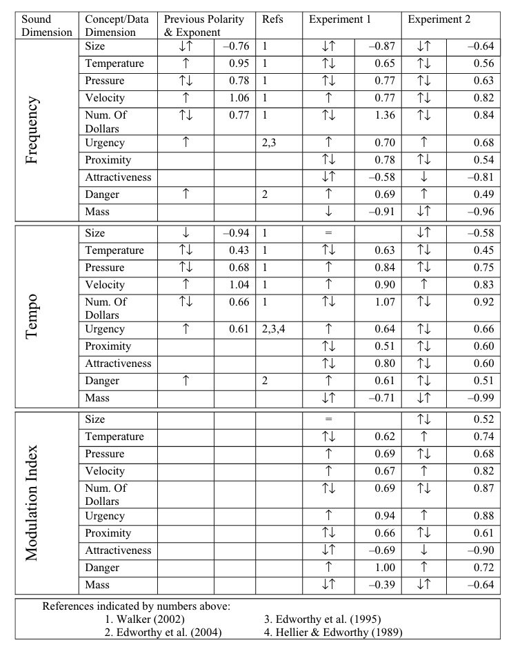
This table summarises the approach that made sense for the majority of people for frequency, which could be used as a guide if you’re making an audio chart representing any of these data types:
| Dimension | Frequency majority polarity |
| Size | Decreasing |
| Temperature | Increasing |
| Pressure | Increasing |
| Velocity | Increasing |
| No. of dollars | Increasing |
| Urgency | Increasing |
| Proximity | Increasing |
| Attractiveness | Increasing |
| Danger | Increasing |
| Mass | Decreasing |
6. Play the data neither too fast, nor too slow
Summary
If your audiochart is too fast, then while the user might grasp the overall trend or shape of the data, it will be more difficult to estimate the value of the data at specific points.
However, if it is played too slow, then while individual points will be more clear, it will be more difficult to keep the whole shape of the data in mind, particularly with longer data series.
In my opinion the ideal approach is to offer two modes – one in which the data is played to give a sense of the overall trend, and another mode which allows the user to pause playback and listen to the data point-by-point at will, with a cursor-style approach.
This is the approach I have taken with the interactive version of noisycharts.
However, if you can’t offer interactivity then Brown 2003 suggested “a delay of 50-70 milliseconds between successive tones allows graphs to be presented at a speed that does not impair comprehensibility”, and Nees and Walker 2007 says “there was a small effect of presentation rate on a point estimation task whereby performance was better with either 1 or 4 data points per second”.
Background
Another important temporal consideration in auditory graph design involves the ideal rate of presentation or data density (i.e., the number of tones presented per second). Nees [33] recently found little effect of presentation rates (ranging from 1 data point per second up to 8 data points per second) on a trend identification task, but there was a small effect of presentation rate on a point estimation task whereby performance was better with either 1 or 4 data points per second. This topic, however, requires more research to determine the unique contribution of presentation rate to auditory graph comprehension.
Nees and Walker 2007
And:
The graph sonification software developed on the MultiVis project allows users to explore graphs at their own pace. The numeric keypad is used to navigate around the graph, one data point at a time, and enables users to control presentation speed and change direction at will. In addition, the software allows users to hear an overview of a graph [7]. The overview is accessed by holding down the key that is used to move through the graph. In the overview mode, if a graph is played too fast it will be difficult for the user
Brown et al. 2003
to interpret. Conversely, if it is played too slowly, the user may have difficulty remembering the shape of the graph. Pilot
testing showed that a delay of 50-70 milliseconds between successive tones allows graphs to be presented at a speed that
does not impair comprehensibility [3]
7. Offer different modes for different tasks
Summary
Just as with data visualisation, where different designs are used to convey different aspects of the data, where possible with data sonification you should offer different modes for different tasks.
As discussed above, in an online chart in which interactivity is possible you might offer at least two modes – a playback mode in which the data is played to give a sense of the overall trend, and a cursor mode which allows the user to move through data point-by-point, with the x axis value read out for additional context as the tone is played.
Another consideration is allowing the user to choose between simultaneous and consecutive playback where it makes sense to do so. Clearly, in a dataset with many data series simultaneous playback would not make sense.
However, for two or three data series, or for one data series and a threshold value, then a simultaneous playback mode allows users to more quickly figure out where the two data series intersect, or where a data series crosses a threshold.
Additionally, there seems to be a difference of opinion on which mode to offer as the default – Flowers 2005 says to prefer consecutive playback, while Brown et al. 2003 says to prefer the simultaneous mode (but allow users to switch between both modes).
Both however agree that the ideal approach would is to allow users to switch to whichever mode they prefer.
Background
Here’s Brown et al. 2003 on simultaneous (parallel) and consecutive (serial) playback:
The parallel mode enables users to complete intersection location tasks significantly faster than the serial mode. In addition, users demonstrated a preference for the parallel mode for these tasks, choosing to spend a significantly greater percentage of time in this mode than in the serial mode when
Brown et al. 2003
looking for intersections [4]. No significant differences in performance were found between the parallel and serial mode
when users were asked to locate global maxima or minima, or in the workload [11] experienced during any tasks. Since users
have expressed a preference for the parallel mode graph sonification systems should default to this mode, but should allow users the option to switch to serial mode.
And here’s Flowers 2005 on the same topic:
For many data exploration activities, a sonification design that permits sequential comparisons of short data streams may be
Flowers 2005
more efficient than one that presents the data streams simultaneously. This may be particularly important for tasks in which detection of differences in pitch coded data profiles or function shapes is important for a research or decision making activity. While profile differences may “pop-out” in visual line graphs when two or more profiles are printed on the same axes (e.g. interaction effects in factorial experiments), such is not the case with pitch-defined data profiles. Melodic (and also temporal pattern or rhythm) comparisons are often best done
sequentially. Software tool development should thus be sensitive to the need to allow continuous listening to data over time, but also to allow selection of segments of interest for sequential comparison. The duration of display segments selected for sequential comparisons is, however, a critical issue
that must take into account the limits of working memory and auditory sensory memory [6].
And later, when discussing approaches that do not work:
Simultaneous presentation of streams with only moderate degrees of similarity can create confusion possibilities, and unwanted grouping. Use of onset envelope differences in timbre and patterned or modulated streams will help keep them separate, but at tradeoff for observing value crossings, etc. This is another reason to design sonification software that can easily switch from simultaneous to sequential presentation of segments of data streams.
Flowers 2005
Conclusion, and a design preview
Both Flowers and Brown et al. have more to say, so it’s worth reading the full papers, as well as Nees and Walker. I’ve summarised what I think are the most important design considerations, but I’d be interested to hear from others working in this area if there’s anything I’ve missed!
Otherwise, here’s a work-in-progress preview of where I’m at with our audio accessibility tool – it works best in Chrome, may have bugs:
These are programatic – that is, the audio is generated based on the data without any additional input from the chart creator. I’m using Tone.js for audio generation, and d3.js for mapping data to pitch frequency.
There’s still some work to be done like enabling pausing during speech playback, ensuring speech works consistently across browsers, and adding a mode for simultaneous playback where appropriate.
Let me know what you think!

Leave a comment